> ## Documentation Index
> Fetch the complete documentation index at: https://langwatch.ai/docs/llms.txt
> Use this file to discover all available pages before exploring further.
# Ops Dashboard
> Real-time pipeline health monitoring with throughput, latency, and error tracking
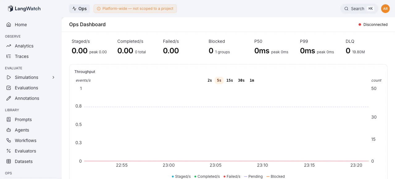
The Ops Dashboard is the landing page of the Operations Console (`/ops`). It provides a real-time view of the event-sourcing pipeline, ingestion rates, processing throughput, latency percentiles, queue health, and top errors, all in a single screen.
 ## Metrics Overview
The top of the dashboard displays six key metrics, each showing the current rate and a secondary stat (peak, total, or count):
| Metric | What it measures | Secondary stat |
| --------------- | ----------------------------------------------- | ---------------------- |
| **Staged/s** | Ingestion rate, commands entering the queue | Peak rate |
| **Completed/s** | Processing throughput, commands fully processed | Total completed |
| **Failed/s** | Failure rate, commands that errored | Total failed |
| **Blocked** | Groups stuck due to errors | Number of error groups |
| **DLQ** | Items in the Dead Letter Queue | Redis memory usage |
| **P50, P99** | End-to-end processing latency | Peak latency |
Metrics marked in red indicate an active problem, non-zero failure rates or blocked groups. Orange indicates a warning state, such as items in the DLQ.
## Active Operations
When a [projection replay](/docs/self-hosting/ops/projection-replay) is running or pipelines are paused, a banner appears below the metrics showing:
* **Replay status** with the current projection name and a link to the detailed progress view
* **Paused pipelines** listed as orange badges
## Throughput Chart
A time-series chart tracks throughput over time, showing staged, completed, and failed rates. Use this to identify processing backlogs (staged >> completed) or failure spikes.
## Pipeline Tree
The pipeline tree shows the hierarchical structure of all processing pipelines. Each node represents a pipeline stage.
Operators with `ops:manage` permission can **pause** and **unpause** individual pipeline stages directly from the tree. Pausing a stage prevents new jobs from being consumed while allowing in-flight jobs to complete.
## Top Errors
The bottom of the dashboard lists the top error patterns across all queues, showing:
* **Count**: how many jobs hit this error
* **Error message**: normalized and deduplicated
* **Pipeline**: which pipeline stage produced the error
This gives a quick signal on whether errors are concentrated in a single pipeline or scattered across the system.
## Real-Time Updates
The dashboard uses **Server-Sent Events (SSE)** for real-time metric streaming. A connection status indicator in the header shows:
* **Connected** (green), live SSE connection active
* **Polling** (yellow), SSE unavailable, falling back to 5-second polling
* **Disconnected** (red), no connection
Both modes deliver the same data; SSE simply provides lower-latency updates.
## Replay History
A compact section at the bottom shows the latest projection replay run with its status, duration, and description. Click it to navigate to the full [replay detail view](/docs/self-hosting/ops/projection-replay).
## Metrics Overview
The top of the dashboard displays six key metrics, each showing the current rate and a secondary stat (peak, total, or count):
| Metric | What it measures | Secondary stat |
| --------------- | ----------------------------------------------- | ---------------------- |
| **Staged/s** | Ingestion rate, commands entering the queue | Peak rate |
| **Completed/s** | Processing throughput, commands fully processed | Total completed |
| **Failed/s** | Failure rate, commands that errored | Total failed |
| **Blocked** | Groups stuck due to errors | Number of error groups |
| **DLQ** | Items in the Dead Letter Queue | Redis memory usage |
| **P50, P99** | End-to-end processing latency | Peak latency |
Metrics marked in red indicate an active problem, non-zero failure rates or blocked groups. Orange indicates a warning state, such as items in the DLQ.
## Active Operations
When a [projection replay](/docs/self-hosting/ops/projection-replay) is running or pipelines are paused, a banner appears below the metrics showing:
* **Replay status** with the current projection name and a link to the detailed progress view
* **Paused pipelines** listed as orange badges
## Throughput Chart
A time-series chart tracks throughput over time, showing staged, completed, and failed rates. Use this to identify processing backlogs (staged >> completed) or failure spikes.
## Pipeline Tree
The pipeline tree shows the hierarchical structure of all processing pipelines. Each node represents a pipeline stage.
Operators with `ops:manage` permission can **pause** and **unpause** individual pipeline stages directly from the tree. Pausing a stage prevents new jobs from being consumed while allowing in-flight jobs to complete.
## Top Errors
The bottom of the dashboard lists the top error patterns across all queues, showing:
* **Count**: how many jobs hit this error
* **Error message**: normalized and deduplicated
* **Pipeline**: which pipeline stage produced the error
This gives a quick signal on whether errors are concentrated in a single pipeline or scattered across the system.
## Real-Time Updates
The dashboard uses **Server-Sent Events (SSE)** for real-time metric streaming. A connection status indicator in the header shows:
* **Connected** (green), live SSE connection active
* **Polling** (yellow), SSE unavailable, falling back to 5-second polling
* **Disconnected** (red), no connection
Both modes deliver the same data; SSE simply provides lower-latency updates.
## Replay History
A compact section at the bottom shows the latest projection replay run with its status, duration, and description. Click it to navigate to the full [replay detail view](/docs/self-hosting/ops/projection-replay).